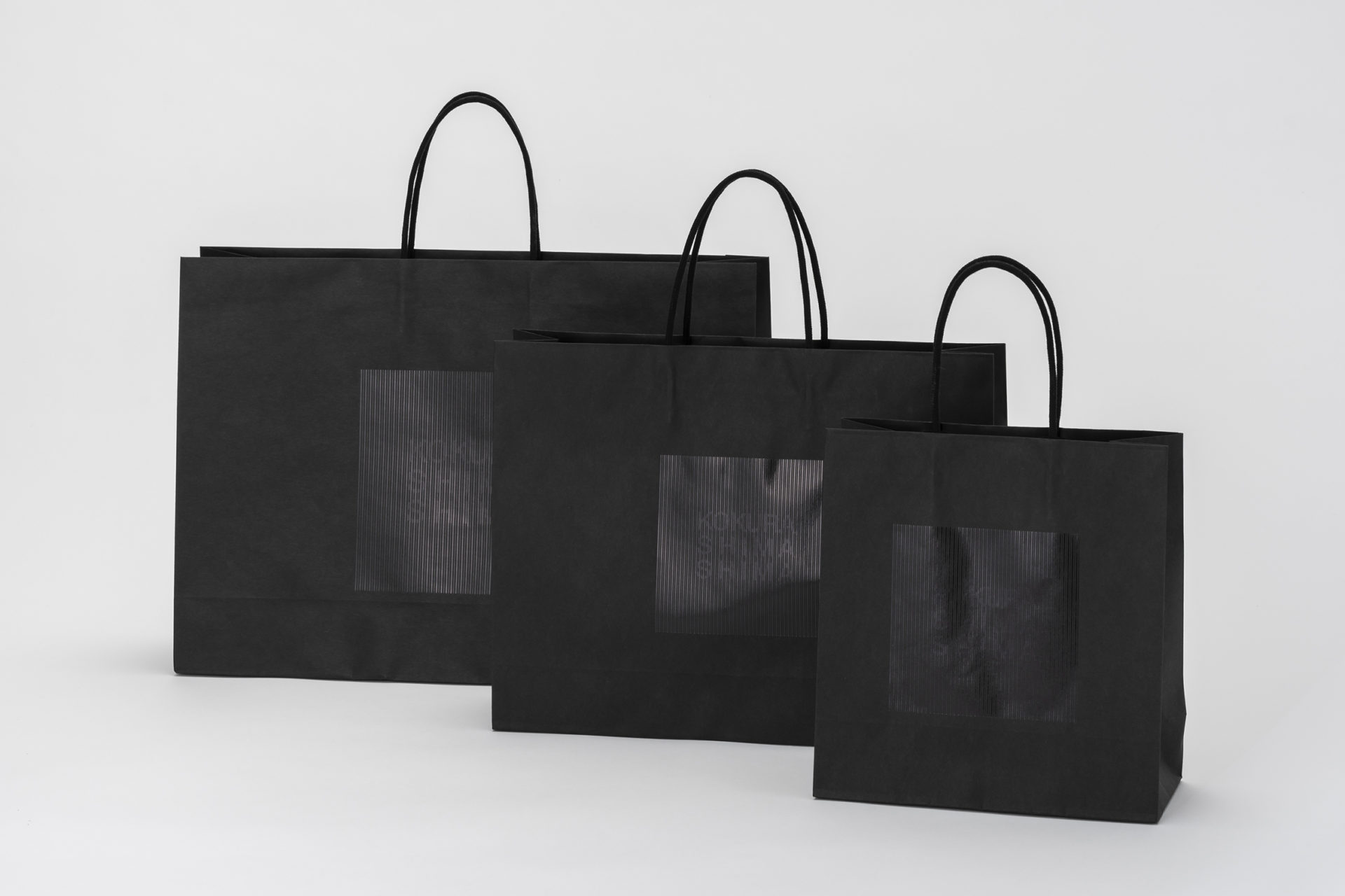
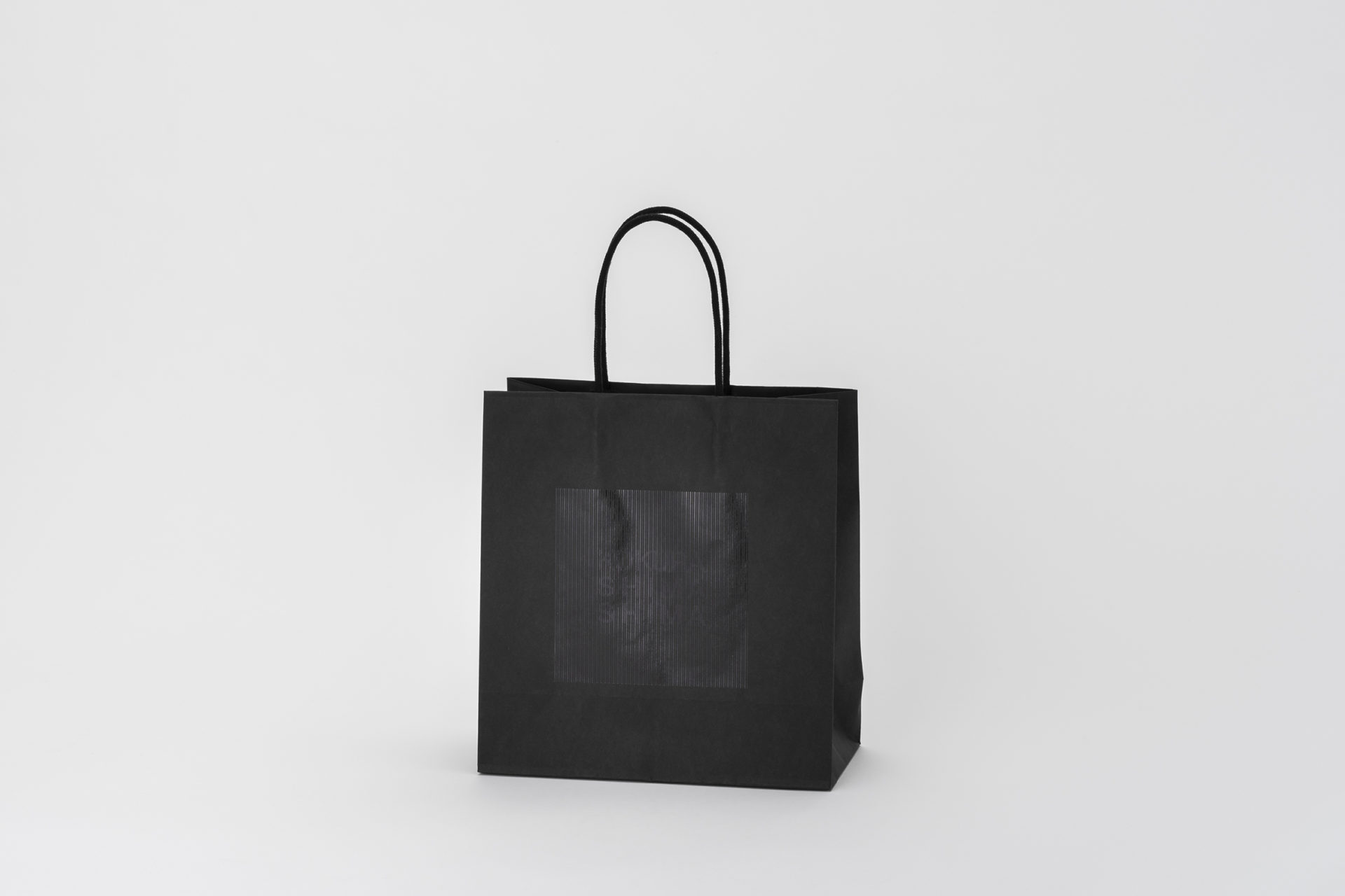
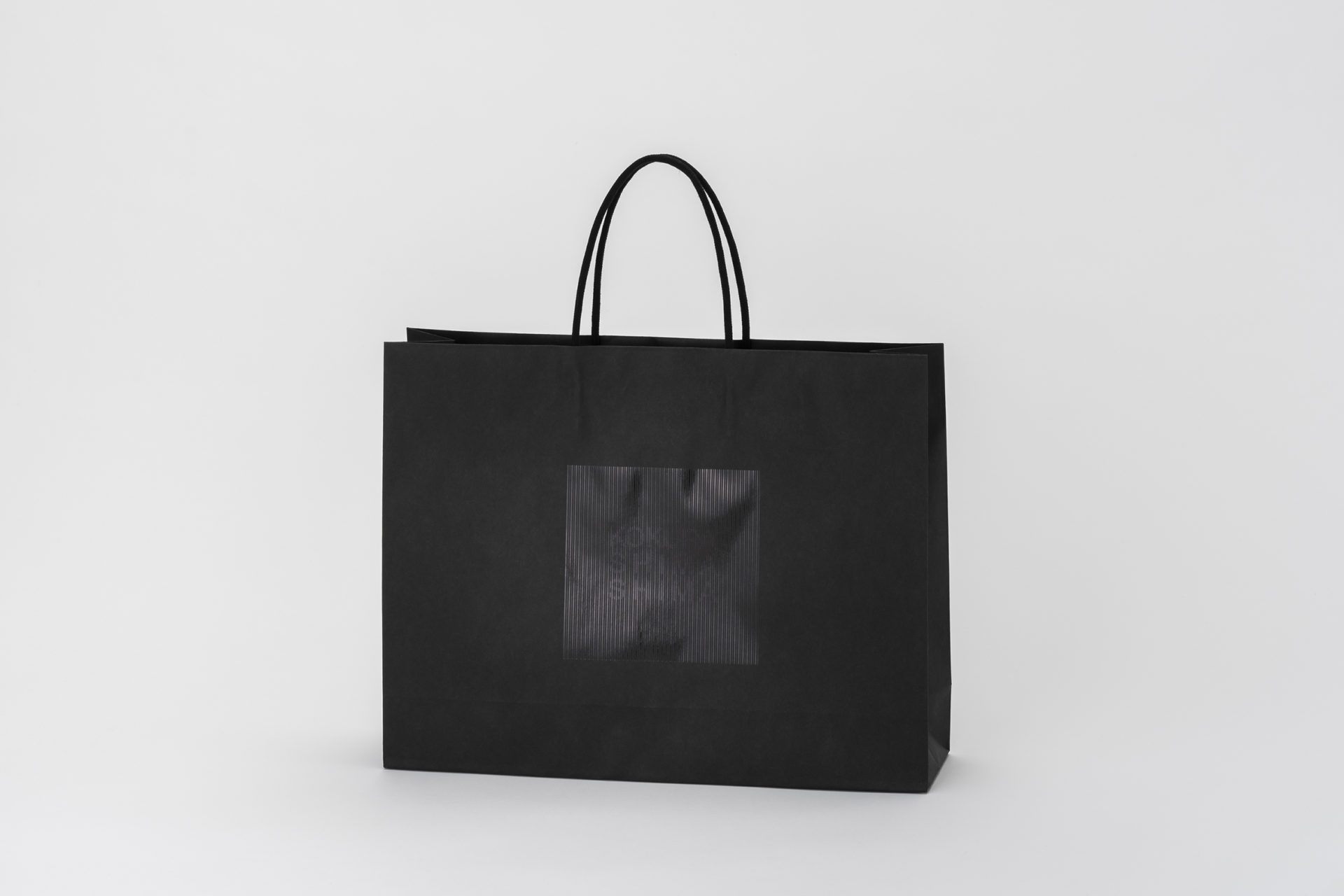
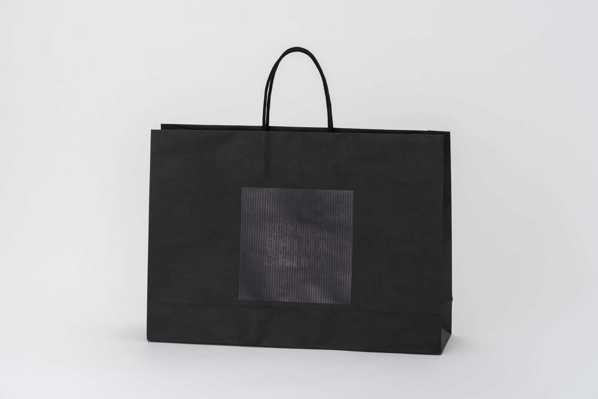
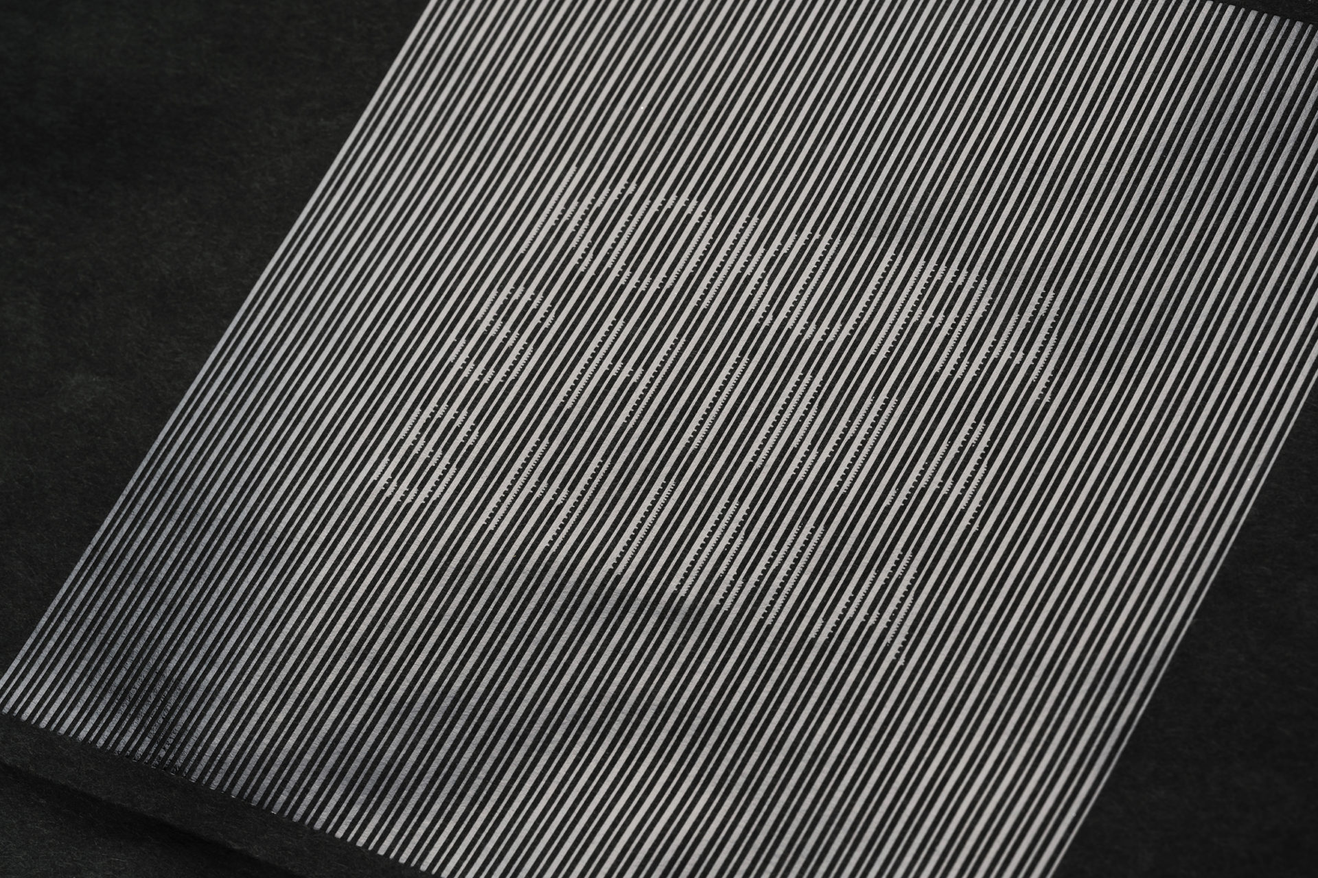
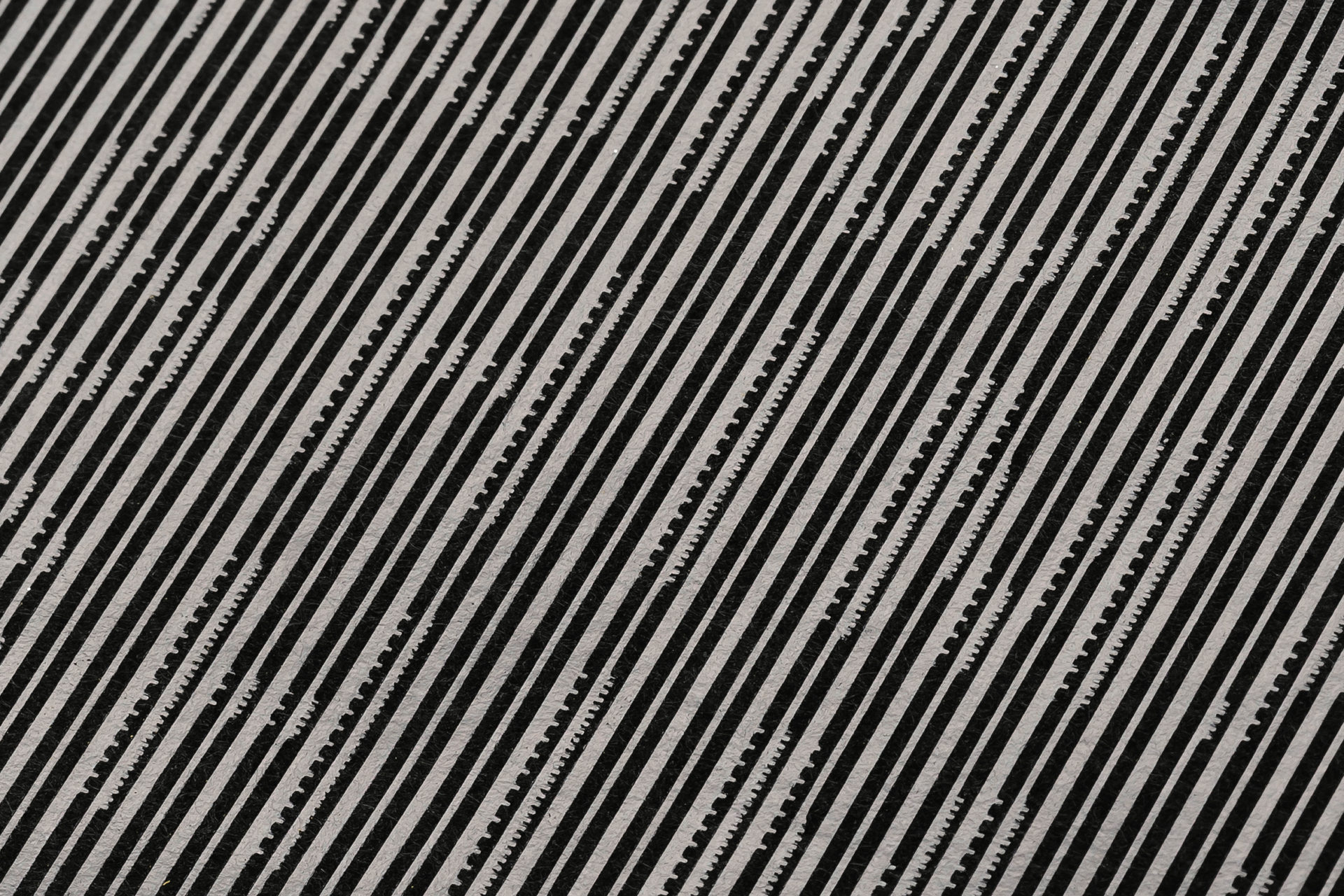
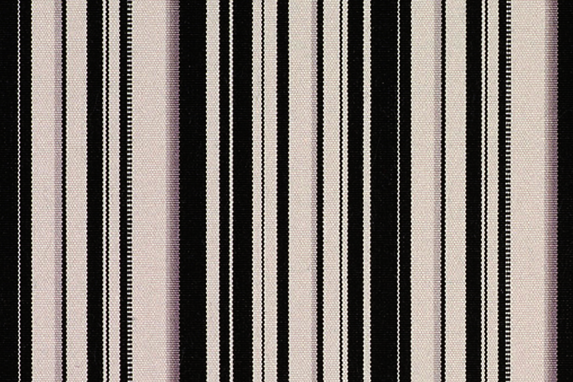
「見た目はシンプルだけど、一捻りどこかに仕掛けのあるDESIGNにして欲しい」と、いつもの様に楽しく難しいお題をいただき、いくつかのPLANをテストしつつ、およそ一年の歳月をかけて完成したSHOP BAG。小倉 縞縞のみなさんと、制作目的はどうあるべきか?ブランドとして、お客さまが手にし、その後も使いたくなるDESIGNを目指し、随分と意見交換させていただきました。おかげさまでとてもブレのない一つの答えにたどり着きました。一見黒い印象のSHOP BAGだけれど、箔押しが 生み出す光沢と若干の凹凸。一つの物であっても様々な視点が存在する立体物と捉えて表現しました。小倉織そのもの「織物」自体をグラフィックで再現する表現が正しいことだと結論付けました。ブランド性、独自性を伝えるために、歴代の生地を見直し、その組織を研究して、見える部分と、なんとなく感じる部分の仕組みを活用し文字が少し消えて見えたり、よく見えたり、控えめながら強い主張が小倉 縞縞らしいSHOP BAGに仕上がったと思います。勿論、完成には制作に関わっていただいた多くのみなさま、製造の職人さん、箔押しの職人さん達の力があってこそです。妥協すること無く完成度を高めていただいて感謝しております。
“I want a design that looks simple, but has a twist somewhere,” was the usual fun and difficult theme we received, and after testing several plans, we completed this shop bag over the course of about a year. What should the purpose of the production be with the people at Ogura Shima Shima? As a brand, we exchanged many opinions with the aim of creating a design that customers would want to use after they picked it up. Thanks to them, we were able to reach a very consistent answer. At first glance, the shop bag has a black impression, but the foil stamping creates a gloss and slight unevenness. We expressed it as a three-dimensional object that can be viewed from various angles. We concluded that the right expression was to reproduce the “woven fabric” itself in graphics. In order to convey the brand and uniqueness, we reviewed the fabrics of the past, studied their structures, and utilized the mechanism of the visible and vaguely felt parts, making the letters appear to disappear slightly and appear to be clearly visible, resulting in a shop bag that is modest yet strong, typical of Ogura Shima Shima. Of course, this project could not have been completed without the efforts of the many people involved in the production, including the manufacturing craftsmen and the foil stamping craftsmen. We are grateful for their uncompromising dedication to perfection.